 I have some clients (who will remain nameless) that like to fill every bit of space they have available with something – text, pics, stars, banners – anything but white space. I guess they believe that they're paying for the space, especially if it's an ad, so they might as well get as much out of it as possible. But I can assure you, that white space is your friend. When a print design, or a even a web page or app page are crowded with elements, it looks crowded. It looks messy. It looks like something a used car salesman would do in a newspaper ad. Okay for showing lots of information about lots of cars, but not very elegant or professional looking.
Yesterday, my wife and I went to the movies. As I was waiting for her to finish filling her Coke, I was looking down the long hallway, checking out all of the movie posters. Throughout the history of Hollywood, there's been some great graphic design done to promote movies. But one poster at the very end of the hallway really caught my attention. Ant-Man and the Wasp.
I was drawn slowly down the hall, like the Tick's moth partner, Arthur, to the backlit sign. It just stood out from all the other posters. I had to see what Ant-Man and the Wasp looked like, and I had to get real close. There they were, fully posed, ready for action, and about 1/2 inch tall each. Now this is an extreme example of white space, but if you look at this poster with a group of others, you have to admit that it stands out. Even more so when they're full sized. It's unique, and that differentiates it from all the others.
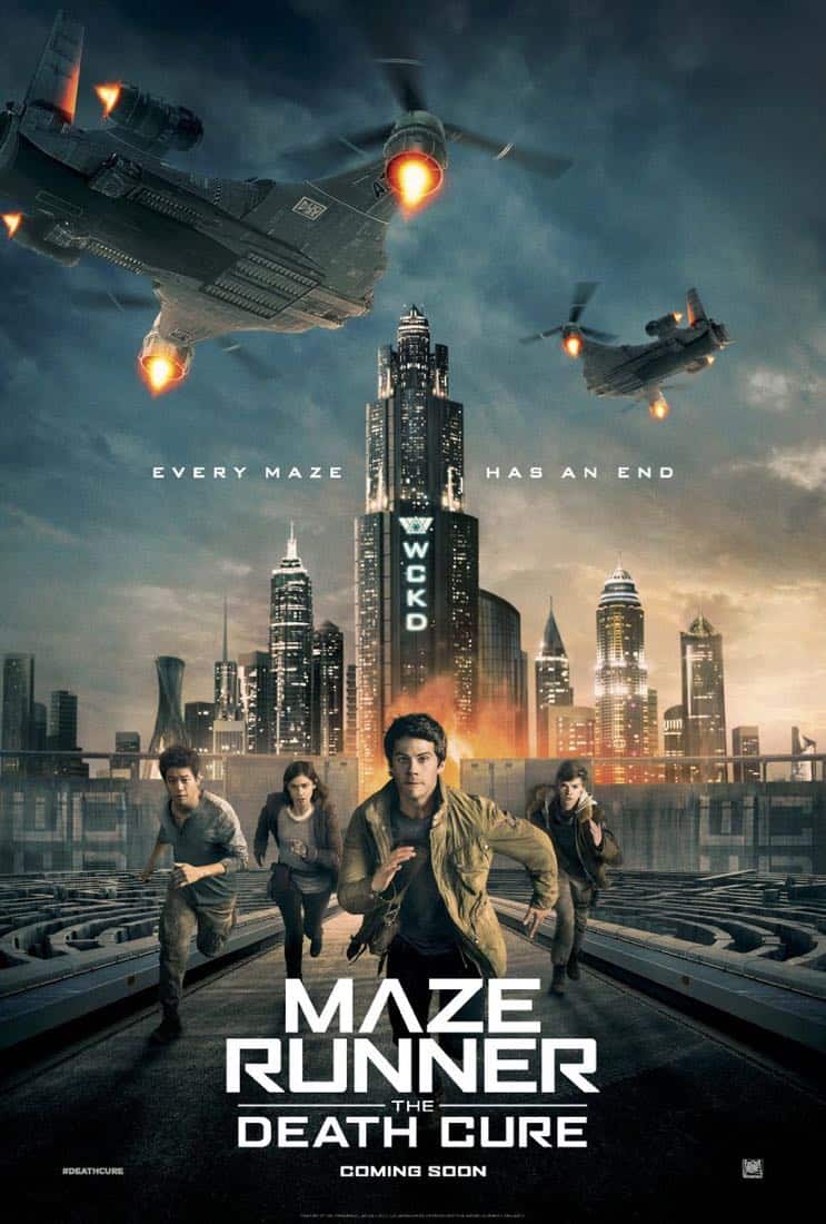
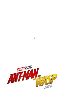
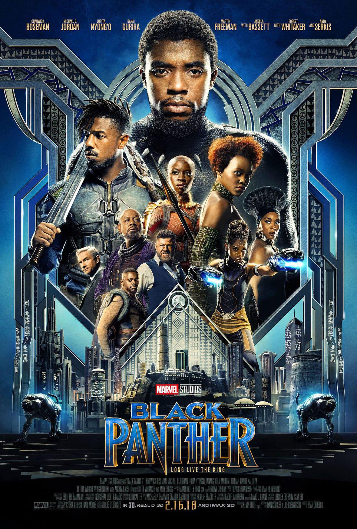
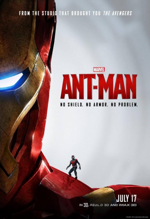
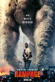
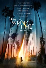
I wish I could show you a zoomed in version of the tiny Marvel superheros, but I can't find a bigger image of the poster. The next time I go to the movies, which will probably be to see Ready Player One with my son, I'll take a picture with my phone. Can't wait!
