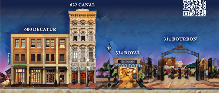
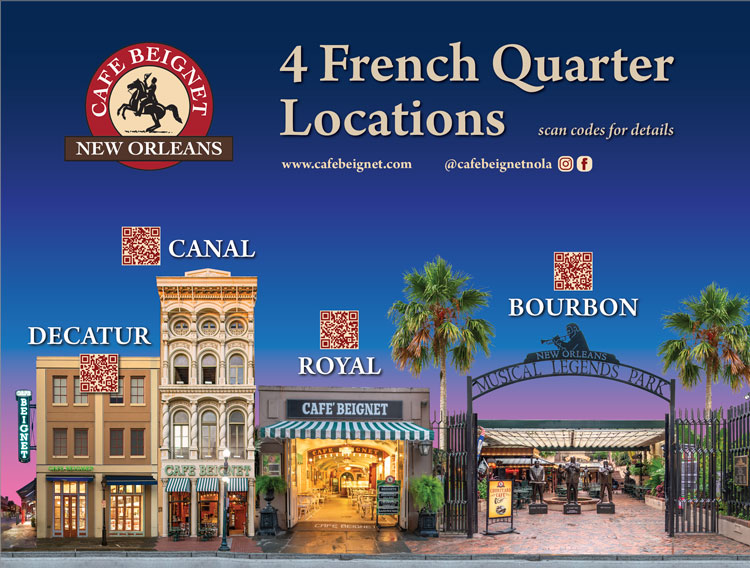
Package and label design
Great packaging does more than hold a product—it tells a story, builds brand recognition, and ultimately drives purchasing decisions. At I Design, I've had the opportunity to develop a range of labels and packaging solutions for Café Beignet products over the past several years, collaborating closely with print vendors and manufacturers to bring each concept to life.


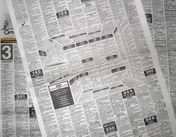
 I have some clients (who will remain nameless) that like to fill every bit of space they have available with something – text, pics, stars, banners – anything but white space. I guess they believe that they're paying for the space, especially if it's an ad, so they might as well get as much out of it as possible. But I can assure you, that white space is your friend. When a print design, or a even a web page or app page are crowded with elements, it looks crowded. It looks messy. It looks like something a used car salesman would do in a newspaper ad. Okay for showing lots of information about lots of cars, but not very elegant or professional looking.