I worked with New Orleans Steamboat Company this summer to develop a set of ads for the Steamboat NATCHEZ, Gray Line New Orleans and Café Beignet. This was my first time doing street car ads (I've done streetcar kiosks and station signs before) and It was a great project that involved some new angles of thought.
Blog
Love that Instagram pic! Think I'll use it too.
It's easy to download photos from the internet, but in most cases, reusing them on your own site is copyright infringement. Photos that are classified as being in the "public domain" are the exception, so be careful when publishing photos or graphics on your site.
Also, with the ease of sharing photos on social media, it's good to know what you can and can't do with someone else's posted photos. Here's a short post from designtaxi.com that explains sharing rules on Instagram.
White space - the right space!
 I have some clients (who will remain nameless) that like to fill every bit of space they have available with something – text, pics, stars, banners – anything but white space. I guess they believe that they're paying for the space, especially if it's an ad, so they might as well get as much out of it as possible. But I can assure you, that white space is your friend. When a print design, or a even a web page or app page are crowded with elements, it looks crowded. It looks messy. It looks like something a used car salesman would do in a newspaper ad. Okay for showing lots of information about lots of cars, but not very elegant or professional looking.
This ad is classified as creative!
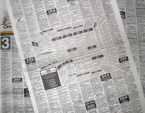 I'm a former newspaper layout and design editor, so I can appreciate this super creative use of a typically boring space.
View full story at Design Taxi.
Home page image slider tips
 In my last news article, Does your website need a hero image?, I questioned whether following this layout trend was absolutely necessary. But I also mentioned that most of my new sites utilize photo sliders on the home page. So, if you're going to use a hero image or a big image slider on your home page, think about how it should look and work. Here are some basic rules to consider.
Does your website need a hero image?
 Take a look at almost any newer website design on the Internet today and there's a great chance you'll see a giant photo or a huge photo slider on the home page. Just like fashion, architecture, and other industries, web design follows trends. People see other sites and they want their site to look the same. They go to seminars where "professionals" tell them "your site must have an enormous photo on the home page."
Calm technology in the era of experience design
From Adobe Creative Cloud blog story by Sheena Lyonnais
Technology is intrusive. It beeps, buzzes and flashes, constantly trying to get our attention. It interrupts us when we’re eating dinner with our loved ones and pushes notifications at us until it succeeds in completely stealing our conversation away. We’re in relationships with our devices and they don’t want us to forget about it. They nag and they nip, shouting about their newest innovations while others flash their latest features at us, tempting us with their flirtation. Our eyes wander to what’s next whether we want them to or not, and before we know it we can barely breathe over the clatter.
Star wars propaganda posters
WWII propaganda posters really stoked the emotions. The U.S. produced almost 200,000 different poster designs during the war and many of the styles still influence poster design today.
For an interesting twist on the U.S. propaganda poster, check out these Star Wars Propaganda Posters designed by illustrator Russell Walks.
Simple design = clear message
I recently redesigned an outdoor advertising campaign for the Louisiana Credit Union league. Last year, they gave me strict instructions to adapt a design that was used in California to the Louisiana market.
Purpose driven designs result in beautiful layouts
I was reading a book on architecture with my son last night and he asked, "which of these buildings is your favorite?" I admire lots of buildings--the genius of the Colosseum, the beauty and scale of Angkor Wat, and the well adorned Chrysler Building to name a few. But that night we also read about the Guggenheim Museum in New York and that's the one I chose.